Making Cuts From Flowers TutorialText & Photographs By Linda Phelps © All rights reserved.
|
Sometimes the background of a lovely flower or another subject is so messy, you do not want to use the captured image as it comes directly from the camera. One alternative is to provide a new background.
This is my personal work flow for this kind of work. There are many ways to do this, but this method works the best for me. In the example shown below, I selected 2 colors to use them to make a gradient across a new page. Go to 'File' in Adobe Photoshop & click 'New'. Set the size & type of image to match your original photo. Be sure to have the same resolution as in the photograph. Then when your have your colors set in the foreground and background in the tool box, click on the gradient tool. Start the gradient in the upper left corner & draw a line on the diagonal to the lower right corner. Here I
added a third darker color onto the extreme lower right corner, and along the lower edge of the page. At this time you can make the new page a different size to accommodate items that need a little extra space for better composition.
You may have other ideas you want to try other than the gradient background. Perhaps you like the colors in the original background and want to save them. In that case it is best to repair the background by cloning or painting out all of the colors in the subject. Then you can add a Guassian blur to taste. This way, there are no problems with the subject color bleeding in to the background. You can use a
very large brush to add a combination of colors that are not a straight gradient. Maybe you can try adding a highlight color to accent a part of the subject. Maybe you want some shading with a texture in it. Use your creative talents to design the background to compliment the subject.
Now set that aside by clicking the little minus sign to put it out of the way. Now I select the magic lasso tool from the tool box & use it to carefully draw along the lines where you want your cut to be. It works well to make the subject as large as you can on your screen. This is helpful when you are going around small detailed areas. It took some practice for me to be able to make smooth lines on curves etc.
You can change the sensitivity of the tool to help it get through those places where the colors are close in tone. Once you have the dancing ants in action, make a duplicate layer of the selection. Now place your move tool on the duplicate & drag it over the new background.
Here is where it can be tricky. First you need to merge the layers. The nest step is to clean up the edges. For this you use the clone tool with a small soft brush for adding bits of color in that missing area. You need to zoom way in close until you can almost or do see the pixels. Then use the soft little brush to fill in places that need it. Use a tiny hard brush for cleaning off edges the were not trimmed close enough. You will want to zoom in & out so you can see how your are progressing with cleaning up the edges. I go all around the added layer while zoomed way in to catch little places that need a little correction.
Once this step is completed, select the blur tool from the tool box. Decide what edges need to blend in with the background and which ones you want to leave sharp to give the objects, like flowers, some dimension. I use the blur tool (set to about 30), adjust size as needed, to go around the edges to be blended into the background. You may need 2 or more passes depending on the softness you want to create. I put the edge of the blur tool on the very outer edge of the flower. When you drag & drop the new cut out onto the new background, there can be a little edge next to the background that is a change in color tone. I go way in again to clone that out when it is an edge to be blended to the background. Otherwise the little line on the sharper parts may work to separate those edges from the background. You have to judge each image by its self to see what adjustments you want to do.
All of this takes time & patience. You can not be in a rush to do this properly. The last step to is to add some unsharp mask, if it is needed. Set the amount some for the sharpness you want to see. Next adjust the radius. The wider the radius the brighter the image will be and the sharpness will increase on the slider. Personally, I set the threshold at 5 levels. This helps smooth things out a bit. They do not get all pixelly. It also enables you to make the image even sharper, if you like, without adding a lot of noise.
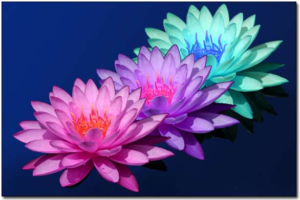
It takes a considerable amount of time to go through this process. Personally, it is worth all the work to have a new image that saves that wonderful image from my camera. You can make the style look natural, or you can give it an artsy look as I have done in the example shown here. These water lilies are the same lovely blossom with the colors changed by a third party plug-in. The color was applied to the
flower while it was on its own background. Thus the tinting is also in the shadows. I have left the darker edge on the two flowers that are layered on top of the first one so you can see how each flower is set off with a darker edge. Another nice feature to add would be a little drop shadow where the petals over lap from one color to the next one after removing the black on the petals.
|
|

