|
I hear time and time again that an image needs more contrast. I usually agree but at times there is a range of contrast you don't want to touch as you work with bringing
up the contrast in other levels, mostly some combination of mid-tone enhancement. Dragging the other tones along can ruin things. There are several ways to do what
needs to be done and preserve those end tones while you do it.
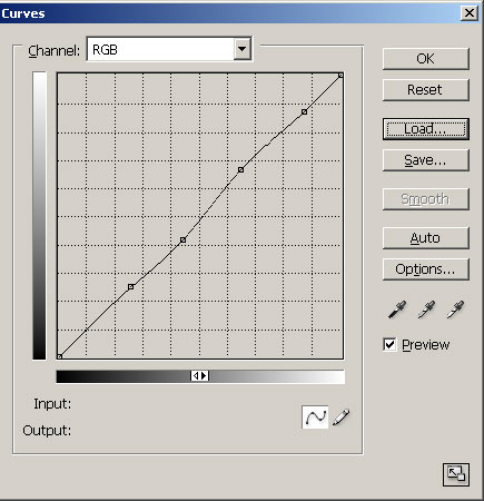
One of my favorites is a simple curve in Photoshop's Curves.

The two inner points are there to increase the contrast in the mid-tones. The two points just outside of those are anchor points so the lighter and darker tones
beyond them will not be affected. There are many ways to draw this curve, some more exaggerated and some less so, slide the anchors out or in more but I like this one
so much that I saved it and can quickly load it from the Curves dialogue box and tweak it further if necessary. It can be immediately faded to any opacity or blend
after using the command or you can use it layers and do the same at any time during post processing.
Using an Action is another good way to get at those mid-tones and leave the end points, to any degree, alone. Tone masks are a superb way to go.
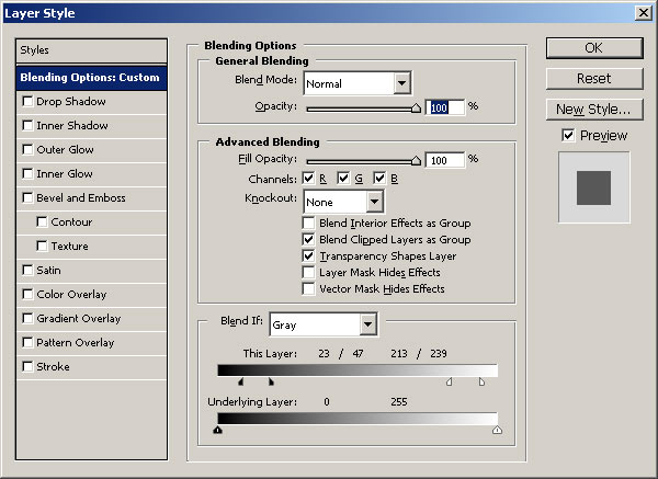
When you work on a Layer, you can double click on that layer after you have used a contrast command and bring up a dialogue box that includes a Blend If feature at the
bottom. There are two layer sliders as you can see below. I have manipulated the "This Layer" slider. Place your mouse over either end slider and pull in to where
you want to bring back certain end tones. Now press the Alt key and do it again with the inner piece of the slider and it will split, leaving your original mark. The
inner split mark will feather your choice to any degree. Of course 0 is darkest black and 255 is brightest white on this scale. When the sliders are moved you will
see these numbers change and show you where your points are set along that scale. You will see another set of numbers appear to show you where your feather points are
set. Keep moving them until you like what you see. A little goes a long way here and the amount that I have moved the slider points is exaggerated.

So when you need more contrast which will give your image considerable punch at times, try these methods until you find one you particularly like. Some work better
on certain types of images. In my opinion, intelligently working with the mid-tones is one of the best ways to improve and clarify your image, livening up the tones to
a beautiful degree. Any of these excellent tools are best used on 16 bit files to avoid postertization and deliver the finest tone graduations possible. Any post
processing with an 8 bit file will chop up a histogram very fast with any significant amount of moves. Every image is different so experiment and get the
tones you want where you want them.
| 
